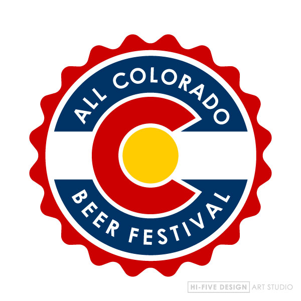
While designing the poster for the “All Colorado Beer Festival”, they asked me to incorporate their logo into the poster somewhere. My first impression was that their logo was a bit out dated. The layout made it hard to read, plus it just didn’t flow and wasn’t very user friendly if you’re trying to apply it to different applications. So I came up with a simple logo that I feel encompasses all the elements that make up the name for this beer fest, Colorado and beer! Here’s what I put together.


