D9 THC Popcorn and Chocolate Mylar Bag Design
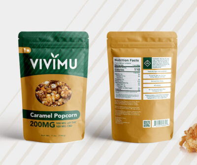
Here is a D9 THC popcorn and D9 THC chocolate mylar bag design for Vivimu, a Denver based marijuana edibles company. The client asked for
Here is a D9 THC popcorn and D9 THC chocolate mylar bag design for Vivimu, a Denver based marijuana edibles company. The client asked for
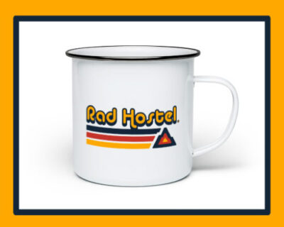
Here is a Colorado Hostel logo design for Rad Hostel based out of Colorado Springs.
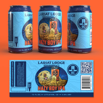
Here is a hazy IPA beer label design for Colorado brewery Lariat Lodge Brewing based in Littleton/Evergreen. The actual artwork was created by their in-house
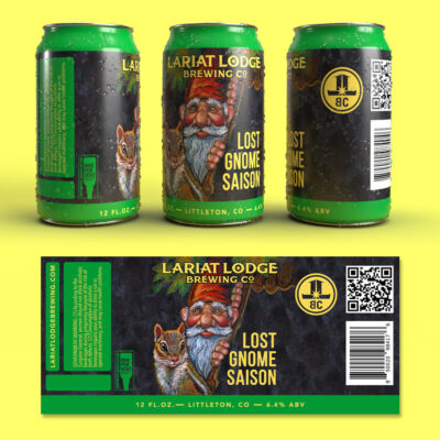
Here is the Lost Gnome Saison beer label design for Colorado Brewery Lariat Lodge in Littleton/Evergreen. The actual artwork was designed by their in-house artist.
Here is a vintage t-shirt logo design for Not a Lib apparel company out of Colorado Springs.
Here is a brand mockup for an Amazon shipping company out of Grand Junction, CO. Product Movement is a veteran owned company so they wanted
Here is a fishing bait packaging design for Grand Junction, CO company Dynamic Lures. This Sneak Attack Soft Swim Jig is designed for multi-species. Since
We’re inching closer to a final veteran logo design for Colorado Springs non-profit, The Home Front Cares. Here’s a branding mockup to demonstrate how this
Here are the military logo designs I’ve put together for veteran owned non-profit, The Home Front Cares. None of these have been finalized by the
We’re currently in the process of developing a real estate website design for Colorado Springs company, Mountain Peak Realty. I always put together a mockup
Here is another logo concept for veteran owned non-profit “The Home Front Cares”. Same general layout as before but with some tweaks. The font is
The gentlemen over at The Home Front Cares, asked me to put together a new logo design for their military veteran owned non-profit organization. Their
Two Colorado Springs business partners came to me because they were looking to branch away from their corporate real estate jobs and venture off on
Here is coffee truck logo design for a gentleman out of Colorado Springs. Despite the fact that the coffee world is an ever growing business,
A roofing company out of Colorado Springs is looking to expand their business into the Arizona territory. Which is where the family owned business is