Revised Logo for the Colorado Apparel co.
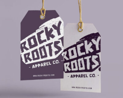
Here is the revised logo design for Colorado apparel company. The client really like the first concept, but we agreed it needed some tweaks. So I changed up the shape of the boulder as well as the font.
Here is a Colorado apparel company logo design. Rocky Roots is a startup and looking to add their twist on Colorado tee’s. My approach was to incorporate a boulder as the background alongside a rocky looking font. I did try incorporating the roots but it just looked odd. I added a texture to the boulder to give it a distressed look. The logo can be used in a vertical or horizontal layout depending on the application. For colors I chose a desaturated dark purple and light grey. Overall it makes for a simple, bold, and cool concept. Apparel logo design by Hi-five design.
Here is a woman hair salon logo design for Colorado Springs based company Shear Underground. This is my second attempt at the hair studio logo design.
Here is a farm house logo design for a new client of mine. The Urban Farm House sells various goodies that she sells at farmers markets across Colorado. Farm girl logo design by Hi-five Design.