Overview: Skin Brava is an aesthetics company based in Colorado Springs and is primarily targeted towards higher-end females (although also serving men) looking to rejuvenate their skin and their overall health.
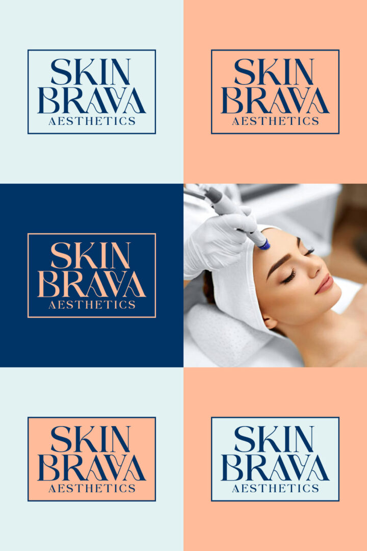
Objective: Create an elegant logo for Skin Brava that attracts a higher-end female customer. The logo should be soft but also carry a sense of confidence.
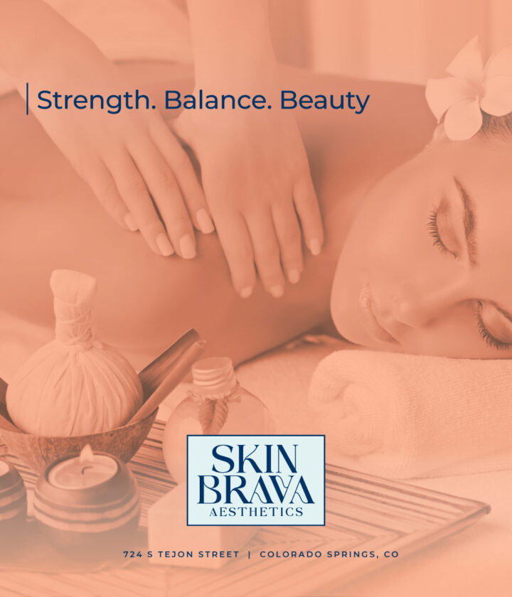
Layout: The logo utilizes a sophisticated wordmark that conveys a sense of strength, balance, & beauty; key characteristics of an individual with true confidence.
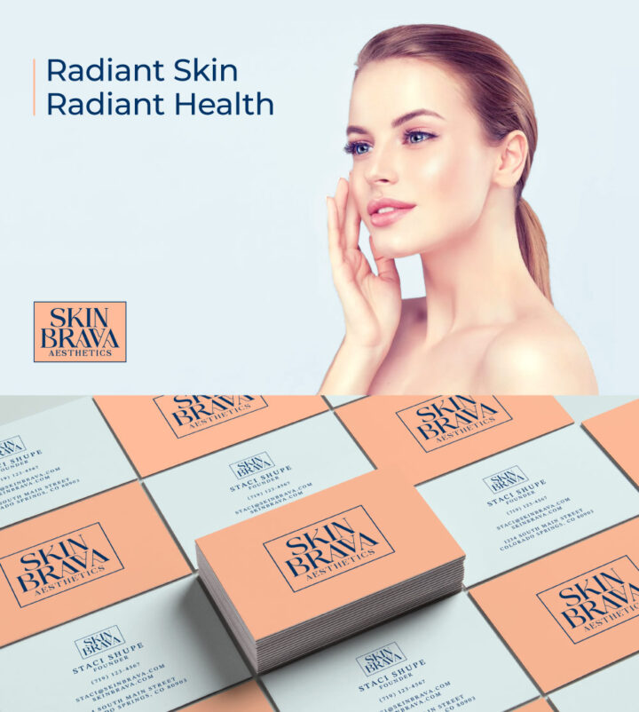
Color Palette: The logo utilizes a minimal color palette that’s easily interchangeable allowing for versatility. The peach and baby blue create a sense of calm while the navy expresses strength and courage.
Typography: The font uses a stylized serif typeface that’s elegant and beautiful while also bold and courageous. Along with the color palette, this font does the majority of the heavy lifting for the brands visual identity. It doesn’t require any flashy icons to attract and engage the audience.
