
Lawn Care & Landscaping Logo Design
Lavish Lawns is a local lawn care and landscaping company serving Monument and Colorado Springs areas. They asked us to rebrand their current visual identity,

Lavish Lawns is a local lawn care and landscaping company serving Monument and Colorado Springs areas. They asked us to rebrand their current visual identity,

Aero Sky is a startup drone company that uses it’s drones for various applications such as advertisement, delivery, and military applications. The clients wanted a

Here is a residential painting company logo design for Colorado Springs based company Veritas Painting. After our first meeting with the owner of Veritas Painting

We started this project some time last year. After putting together the complete visual brand design for a THC/CBD smoke shop, the client asked us
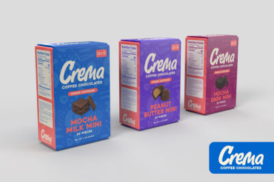
Currently working on a coffee chocolate logo & packaging design for “Crema Coffee Chocolates”. This is a Colorado Springs brand. These are targeted primarily toward
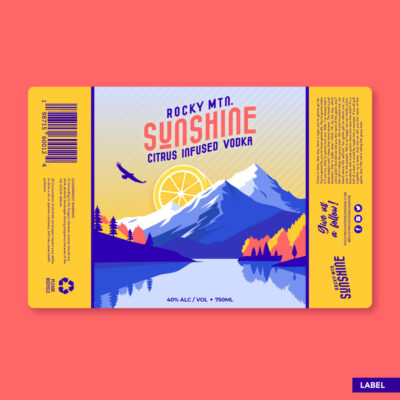
Here is a vodka bottle label design for a new liquor brand Rocky Mountain Sunshine. This is a citrus infused vodka label design. The logo
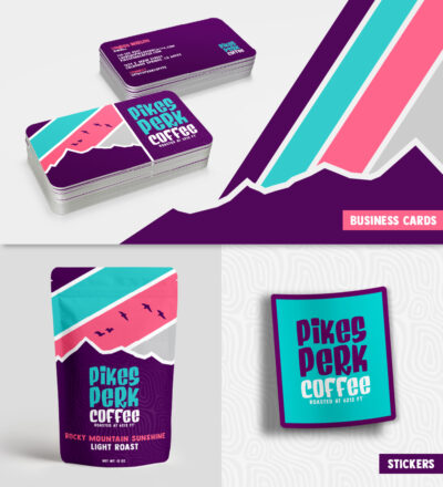
Pikes Perk Coffee Roasters was recently purchased by new owners. They asked Hi-five Design to re-imagine the brand so that it aligns with their goals.
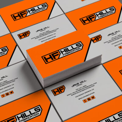
Here is a fabrication logo design for Colorado Springs based company Hills Fabrication.

Here is a hot air balloon logo concept for Colorado Springs bases non-profit United Providers. The client asked to incorporate the hot air balloon to
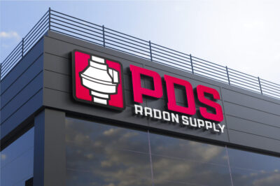
Here is a radon logo design for Colorado Springs based company PDS Radon Supply, a hard working family owned business. We designed their visual brand

Here is an HVAC logo design for Colorado Springs company MJ Heating and Air. This is a small family owned business with over 35 years

Here is a computer engineering logo design for Geekr.io. They’re a Colorado Springs based company offering an online portal that connects business owners to qualified
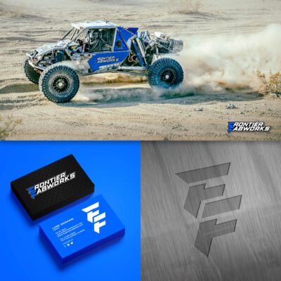
Here is a 4×4 rock crawling fabrication shop logo design for Colorado Springs company Frontier Fabworks. The client had a couple requests for this metal
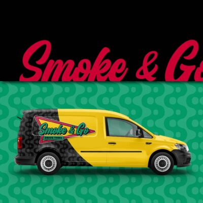
A longtime client of mine is kick-starting a new business venture. It’s going to be a smoke shop selling cannabinoid products, including Delta 9, Delta
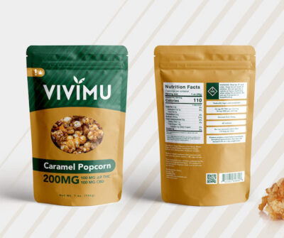
Here is a D9 THC popcorn and D9 THC chocolate mylar bag design for Vivimu, a Denver based marijuana edibles company. The client asked for
At Hi-five Design, we build brands with brains and a backbone. Based in Colorado Springs, we specialize in strategic brand development for businesses ready to grow, stand out, and lead with confidence.
We don’t do fluff—we do purpose-driven design that connects, inspires, and performs. Every project is grounded in strategy and brought to life with bold creativity. Whether you’re launching something new or leveling up an established brand, we help you own your space and speak your truth.
Great design isn’t a luxury—it’s your leverage. Let’s build a brand that’s unforgettable.