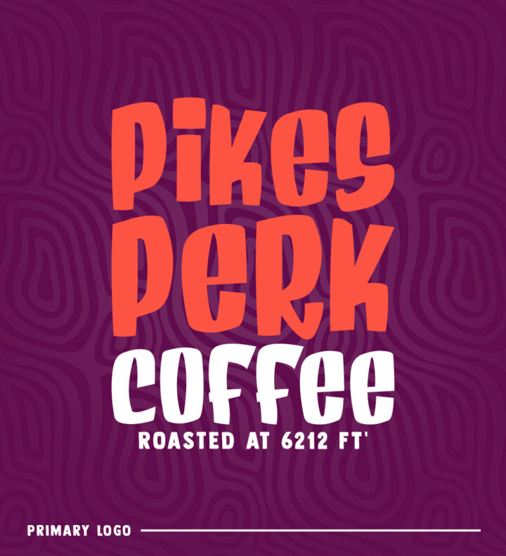
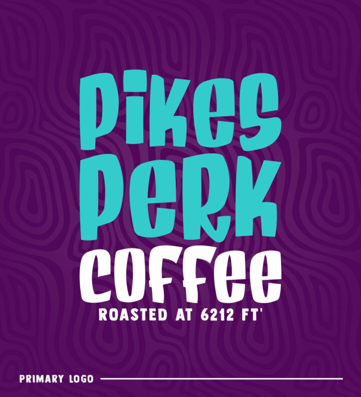
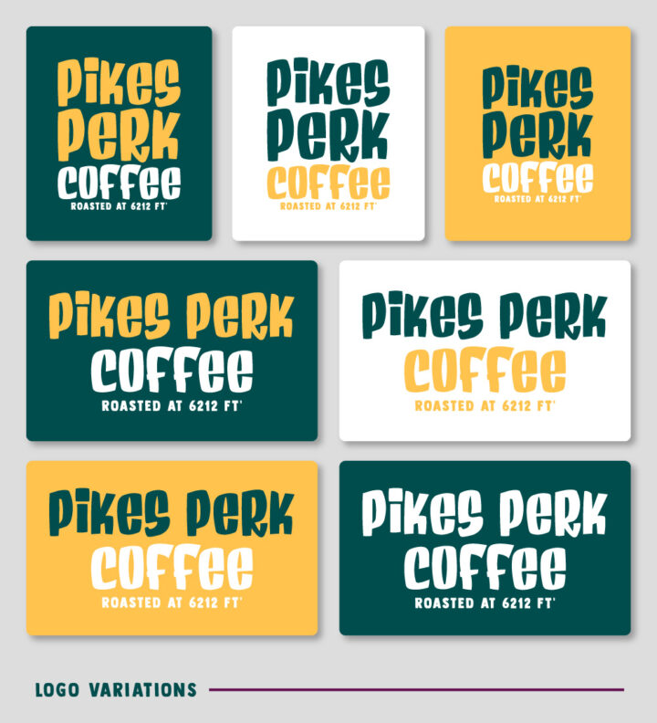
Pikes Perk Coffee Roasters was recently purchased by new owners. They asked Hi-five Design to re-imagine the brand so that it aligns with their goals. After great meeting, we all concluded to go in the direction of something fun, colorful, and packed full of character. The client left all the creative work up to us so we let our imagination run wild.
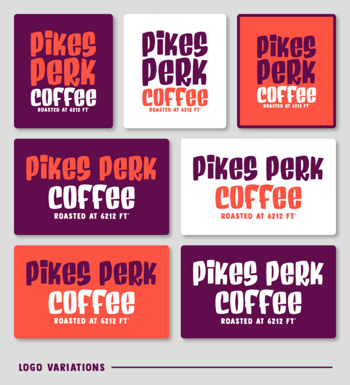
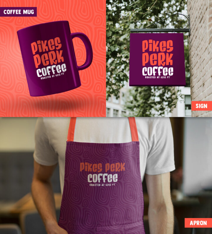
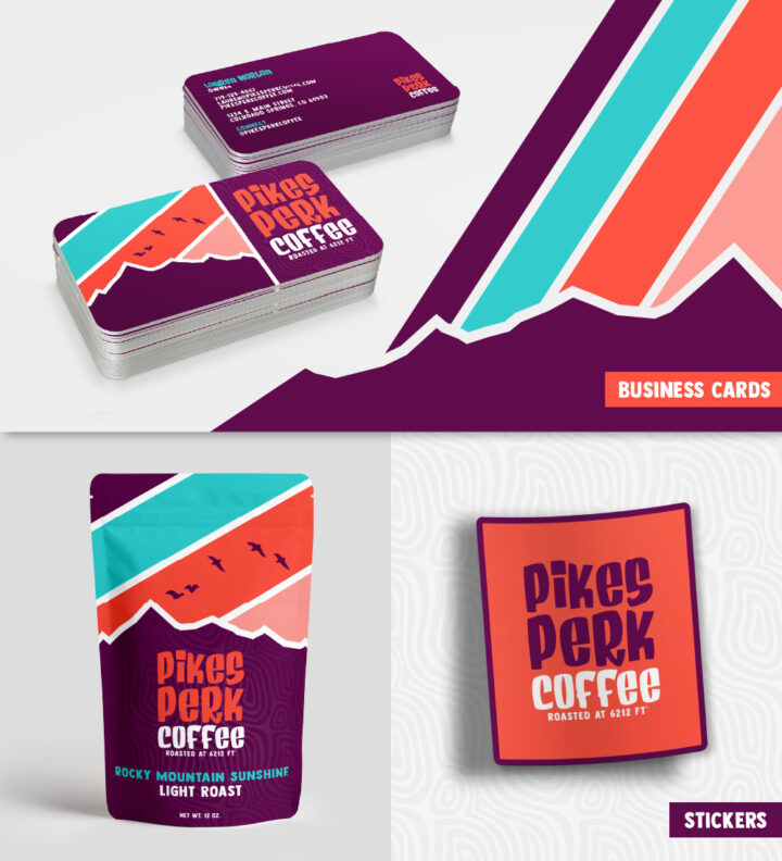
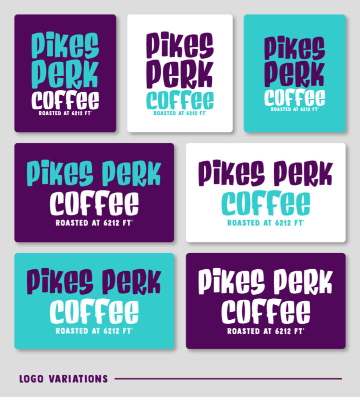
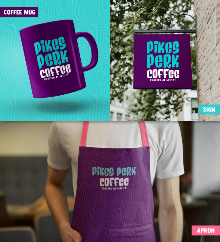
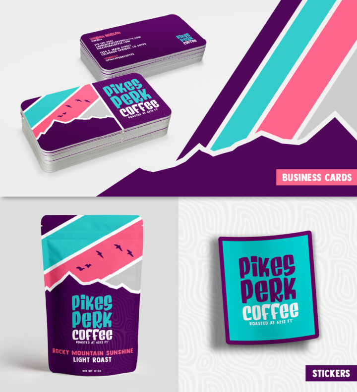
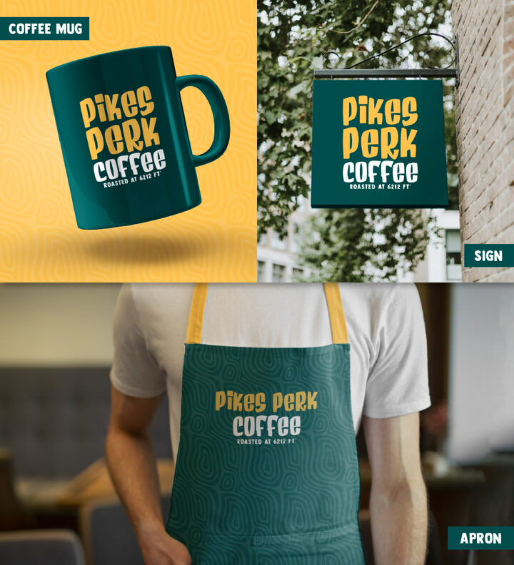
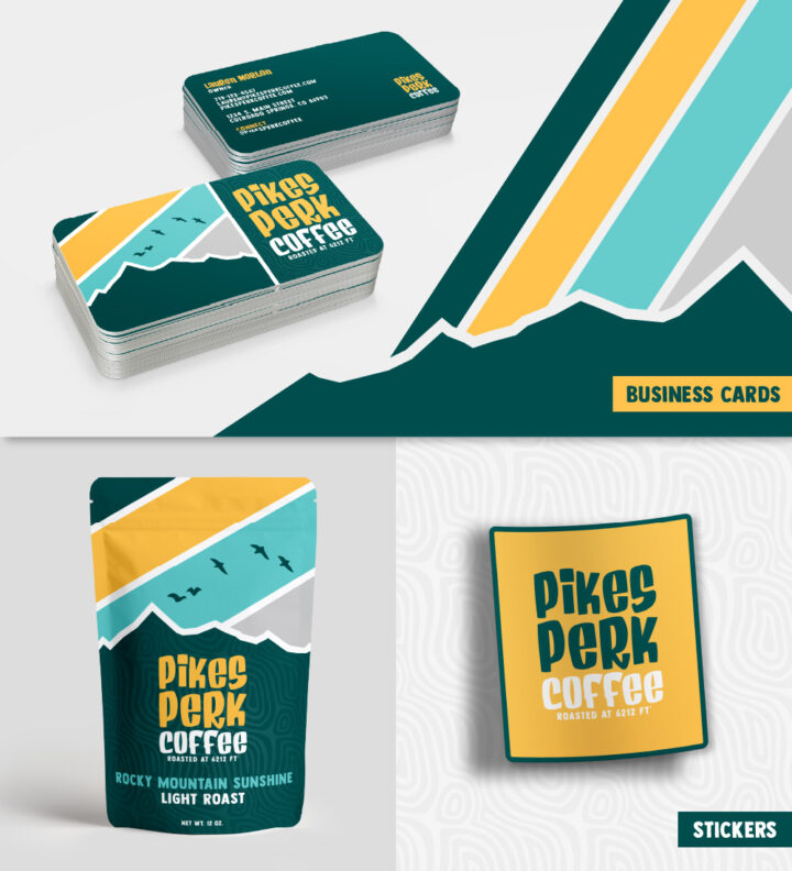
Even though the company name mimics Pikes Peak, we didn’t want to go after the traditional mountain range/peak approach which seemed a bit too obvious. Instead we stuck with a fun wordmark and incorporated the mountains intermittently on various applications. Here’s what we came up with.
