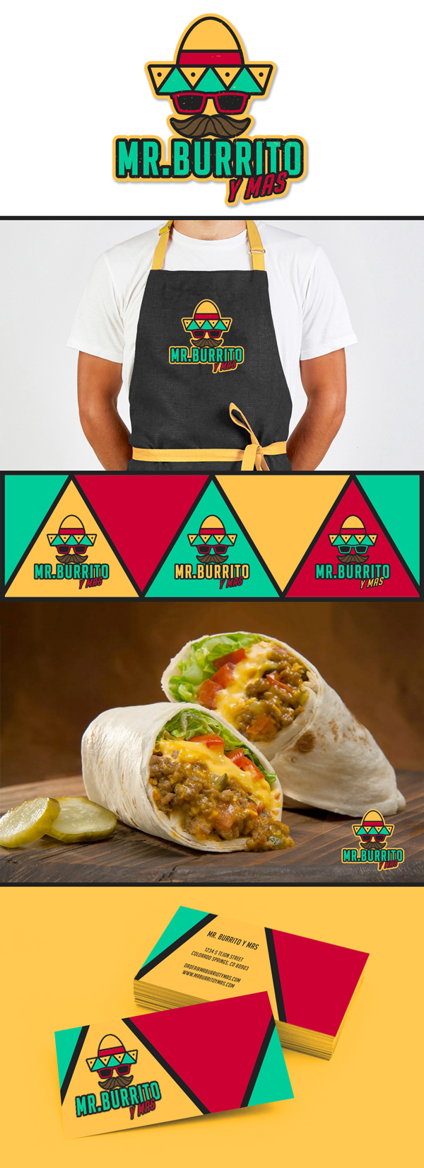
Just finished mocking up a burrito logo design for Colorado Springs company Mr. Burrito y Mas. This gentleman came to us after the first graphic designer he hired failed to meet his expectations. Being that this market seems to have a younger demographic, we wanted to give this logo a cool vibe, so we threw in some shades and a loud color palette. We kept is simple and bold just like all our work. We like the idea of mixing around the color palette. It still maintains brand recognition while allowing for versatile applications on different backgrounds. Dig it!


