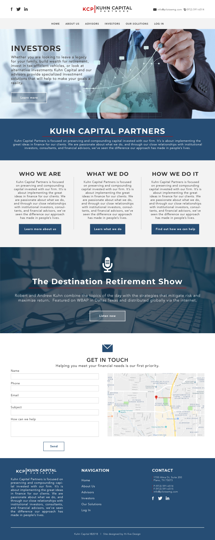
We’ve been working with an investing company out of Plano, Texas. They’re restructuring their business and need to promote their bold new ideas. So we’re designing a new investing website for them, here is our first concept. I’m sure there will be plenty of changes to come as we dive a bit deeper into this project. It’s nice to have a first draft though, this gives us a frame of reference as well as a sense of direction.
I always have my clients send me a Word doc with a complete breakdown of the site, including the content for each page. Even then it can be tricky some times to make sense of what the client is actually wanting. So putting together a template in Adobe Illustrator gives us and the client a better idea of what the site is going to look and feel like. We can hammer out all the tweeks rather quickly prior to actually building the site in WordPress. This saves us time and usually a headache or two.


