Punch Card Research started as a small personal blog out of Michigan. They research the data from both large and small businesses. Their idea is to give readers some detailed insight into which companies are worth investing in and which ones to avoid. The concept behind the name ‘Punch Card Research’ is that if a potential investor only has ‘X’ amount of investments to make over his/her lifetime, they might choose a little more wisely before investing their hard earned money into a potentially hazardous business model.
Do to a high demand from their extensive readers, Punch Card Research has hired Hi-five Design to put together a simple branding package for them along with a new website that proudly promotes their knowledge into the business world.
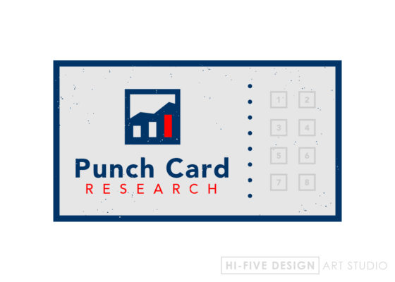
Here is my first approach towards the logo. My thought process behind the design was to incorporate a graph for the companies logo. So within the box is both a line graph and a bar graph symbolizing growth. The lettering is very bold and simple. I used navy and gray as the main colors since they represent both a professional and corporate mentality. Being that you’re doing research on companies growth and success, it seemed fitting. I used the red as something to catch the eye and make the logo a bit more recognizable. The red also symbolizes the word “research” which and is also used in the bar graph within the logo, so the two coincide. I imagine most people stick a punch card in there wallet so it gets a bit beat up from being taken in and out. This is why the logo has a bit of a grunge effect to it.
And that’s the silly psychology behind the logo concept. Lets see what the client thinks.


