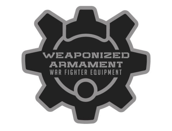
Here is a logo concept for a new company out of Colorado Springs, Weaponized Armament. This is definitely the first time I’ve worked with anyone in this industry.
First Attempt
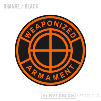
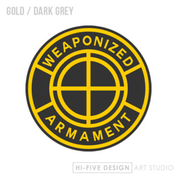
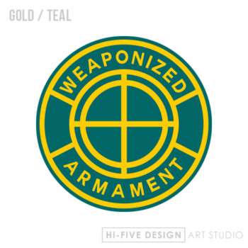
I didn’t want to come right out with an AR-15 for a logo, too expected. I wanted to keep it a little more subtle so on the first attempt I went with a scope type design. Simple and bold, just the way I like it.
Second Attempt
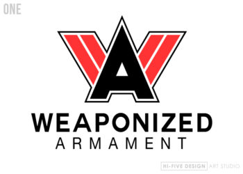
The client mentioned incorporating the W and A together so here’s the second attempt in a few different styles and color combos.
Third Attempt
The client decided he wanted to incorporate an AR-15 bolt. I like this idea because it’s less abrasive than just coming right out with a silhouette of an AR-15. The lettering is made from scratch, no dafont.com used on this one. So far we have three completely different style of designs here. Lets see what the client has to say about this one.
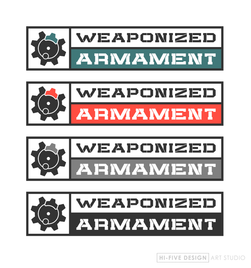
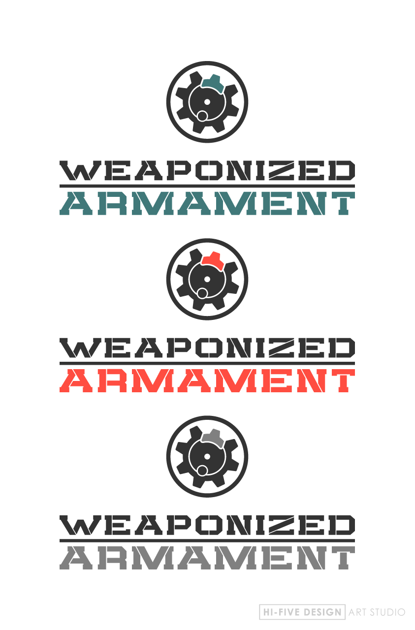
Fourth Attempt
Moving forward, the last design seems to be headed in a positive direction. This design seems to add a little more edge.
