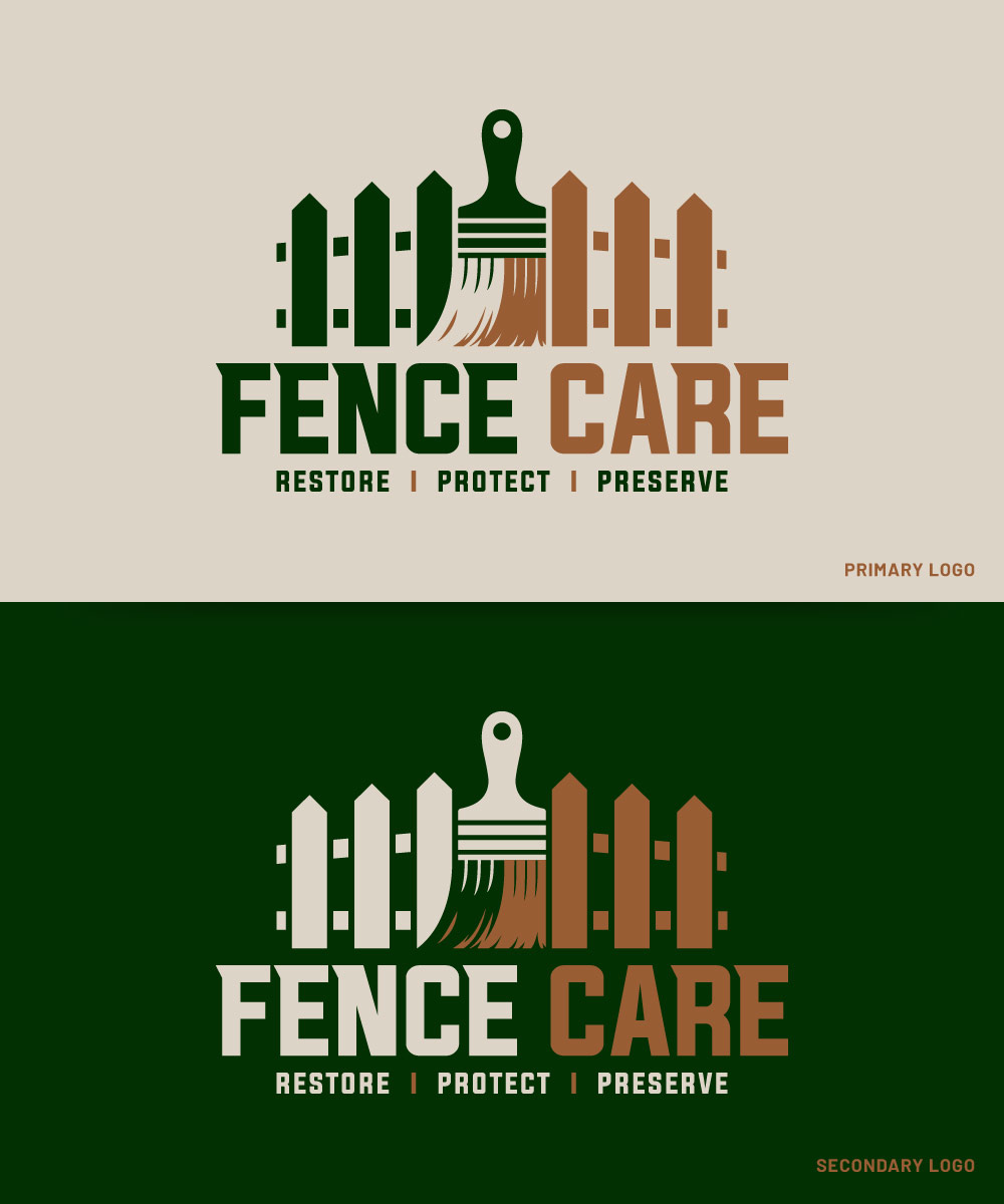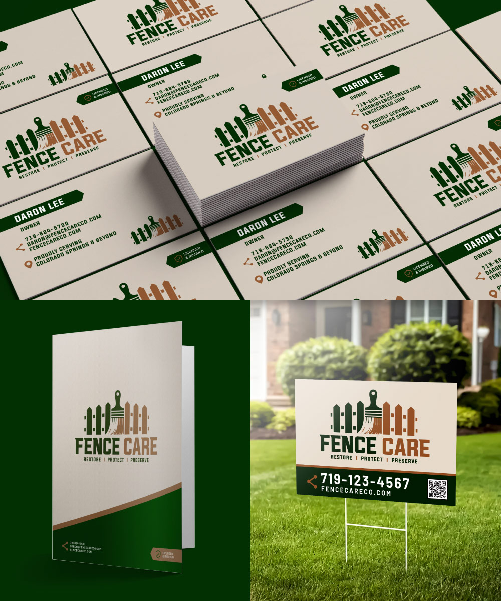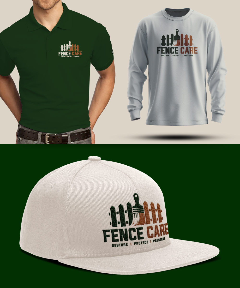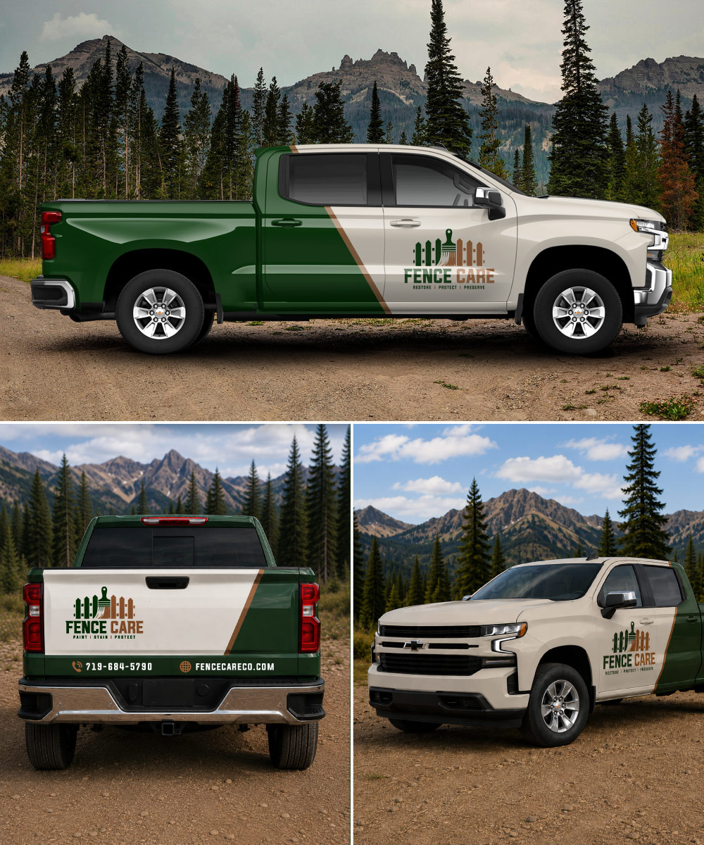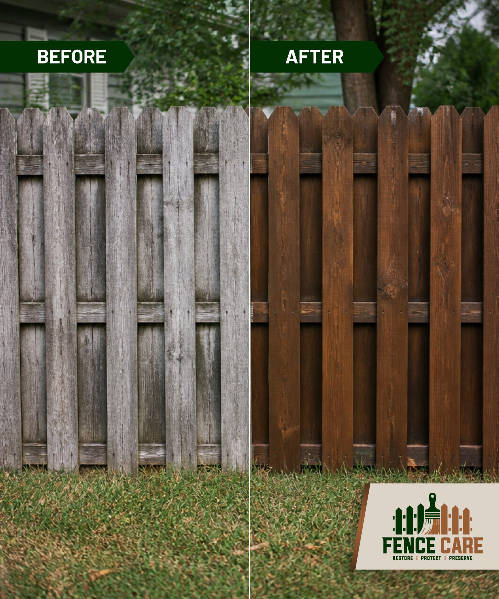
Here’s a recent logo and brand identity created for Fence Care, a Colorado Springs-based company specializing in fence painting, staining, restoration, and repair.
One of the biggest challenges with this project was communicating what Fence Care doesn’t do. They aren’t a traditional fence installation or fence building company. Instead, their focus is on restoring, protecting, and extending the life of existing fences.
That distinction became a major part of the design direction. We made the paint brush a prominent element of the logo and integrated it directly into the fence illustration. The tagline, “Restore | Protect | Preserve,” reinforces the idea that Fence Care is focused on maintaining and revitalizing existing fences rather than building new ones.
The visual identity was designed to feel professional and established while still connecting to the natural, outdoor environment where the company operates. The deep green and warm brown color palette reinforces that connection while giving the brand a distinctive look.
We developed a complete brand identity including the primary logo, business cards, printed materials, yard signage, apparel, vehicle graphics, and other digital assets. The logo can also be inverted between light and dark backgrounds, giving the identity flexibility across a wide range of applications.
The goal was to create more than just a recognizable logo. The identity needed to give Fence Care a professional foundation they could build on as the company grows.
The result is a clean, versatile brand that clearly communicates what Fence Care does and gives the company room to grow.
Here’s what we came up with.