Here’s a recent HVAC logo design created for Antero Air, a Colorado Springs-based duct cleaning company. The name Antero Air comes from Mount Antero, one of Colorado’s prominent 14ers near Buena Vista.
The main challenge with this logo was finding a way to incorporate a mountain into the design while avoiding the generic “Colorado mountain logo” look that has become so common.
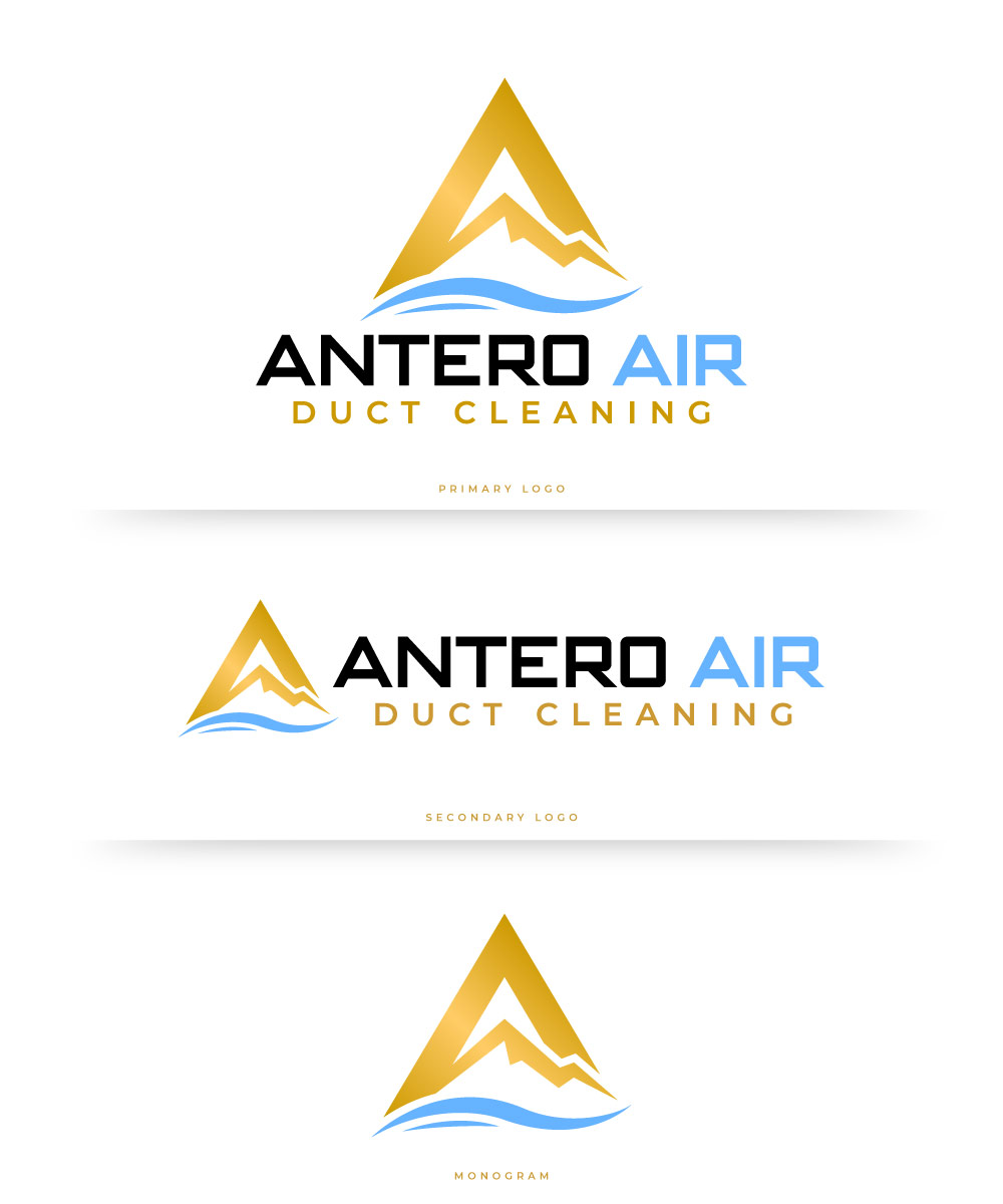
My initial concept was to create an icon that combined the letter “A” from Antero with a simple, stylized mountain peak. Rather than trying to create an exact representation of Mount Antero, the goal was to capture the idea of the mountain in a clean, recognizable way while making the icon unique to the Antero Air brand.
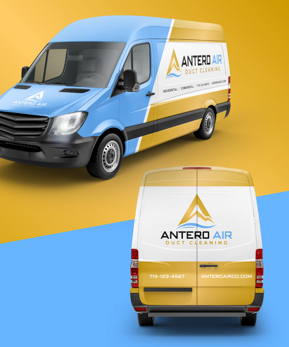
The final identity includes two logo layouts, along with the standalone mountain “A” icon. This gives the brand flexibility across everything from business cards and apparel to vehicle graphics, signage, and other marketing materials.
The client also wanted gold incorporated into the color palette. We used a subtle gradient to give the gold some depth and dimension in digital applications. For select printed materials, such as business cards, gold foil can be used to give the logo an even more premium finish.
The result is a clean, distinctive identity that connects the Antero name to the Colorado landscape while still feeling professional and appropriate for an HVAC company.
Here’s what we came up with.