Website
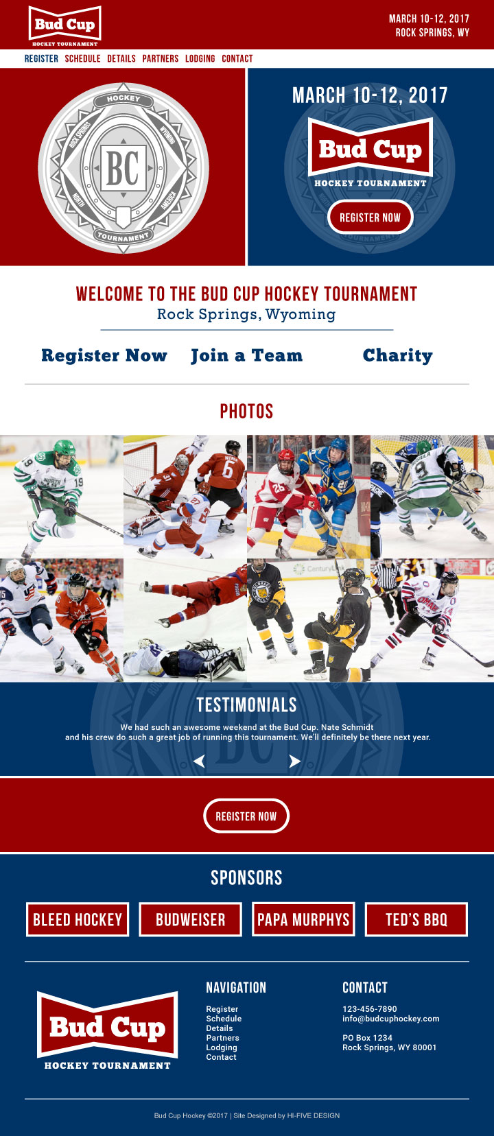
Out of the goodness of my heart, and being that the boys that run the Bud Cup Hockey Tournament are so generous to me, I offered to design a website for them. They don’t really have any online presence to promote this hockey tournament so I thought it would be a nice idea to put them on the map. Below is a JPEG mockup of the hockey website I designed. I did use the Budweiser logo for a bit of influence on the website layout. Not a lot of imagery, just some cool graphics. The actual site is already underway as I type. Should be wrapping up in the next week or so.
Logo
The logo concept is based off the new Bud Light logo, the new Budweiser logo and the old Budweiser logo. I didn’t want to completely rip off Budweiser, but I think it turned out pretty nice. Clean and simple, nothing to flashy and nothing to contemplate. It just works. I also used the old time AB crest, it adds a nice touch and helps to push the Budweiser theme a bit more.


