Website
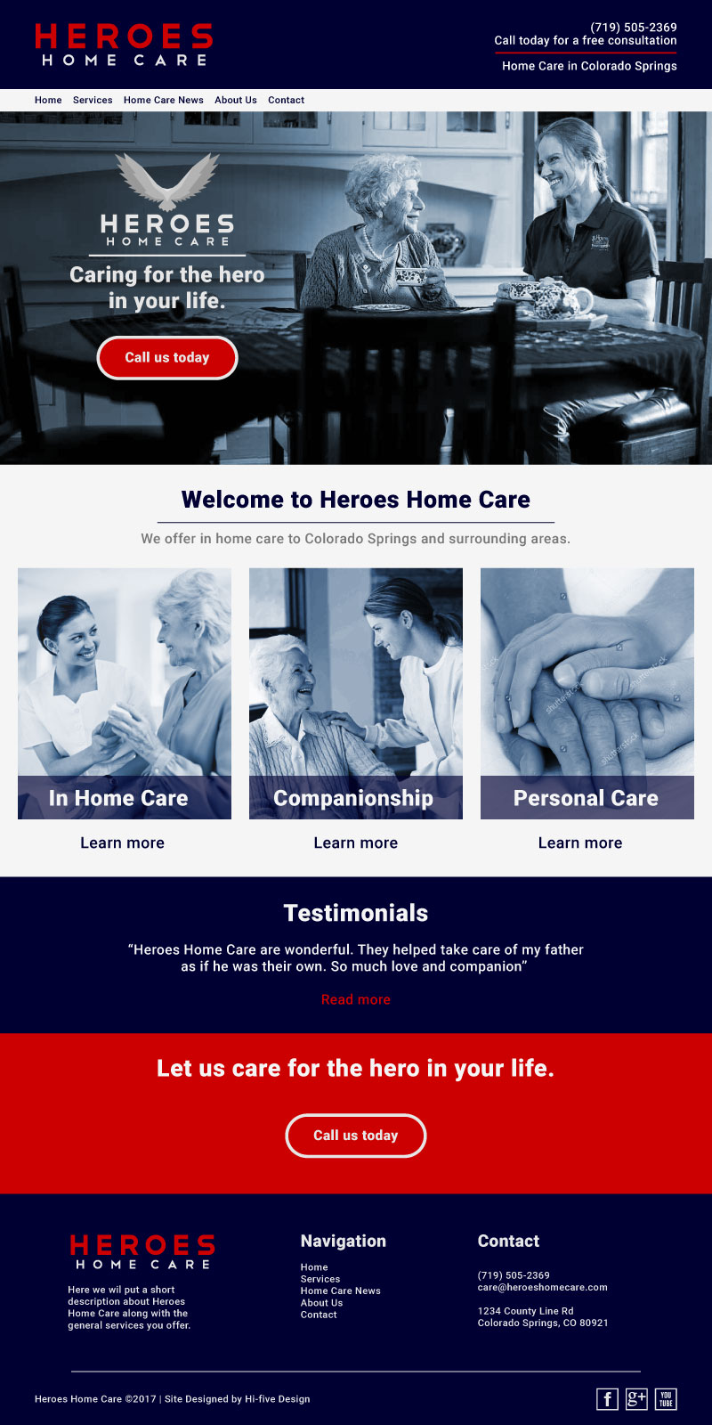
Heroes Home Care out of Colorado Springs asked us to put together a website design mockup for them. Below is my breakdown of the homepage along with a JPEG mockup. All images are temporary fillers but you get the idea. Designing sites in Illustrator, prior to actual construction, is a great way get a good visual reference of the direction you’re going to go in. It can also save you a ton of time. Work smarter, not harder ding-dong.
Header – Logo followed by call-to-action on the left
Menu – Services will have a sub menu for the services offered.
Main photo – This area can be a slider to navigate through various images or services offered however I don’t think it’s necessary. I like the single image with your logo and slogan, along with another call-to-action. I imagine the audience isn’t going to be too tech savvy, simple is better. This image is nice, would be better with a senior veteran in place of the elderly lady.
About us – Simple message that lets the audience know what you do and the area you serve. This will help with SEO as well.
Services – Simple and direct, each image will link to a separate page about each service with detailed information.
Testimonials – We can rotate out new testimonials as needed, this is great for building trust with new clients.
Call us today – Another call-to-action (I use the word call instead of contact because I know how important it is to have that personal experience with someone and emails just don’t deliver). I think you’re more likely to get someones business by making it personal.
Footer – Another logo for brand awareness with a short description about your business. Followed by navigation and contact info.


